

People sign up, then stall.
Sign-up feels longer than it should, and some people give up before they reach the good part.
A senior designer uses your app the way your users do, screen by screen, on desktop and mobile.
You get a prioritised list of what to fix, redesigned key screens, and an hour estimate against every change. Fixed price, in one to two weeks.
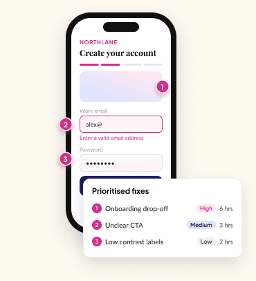
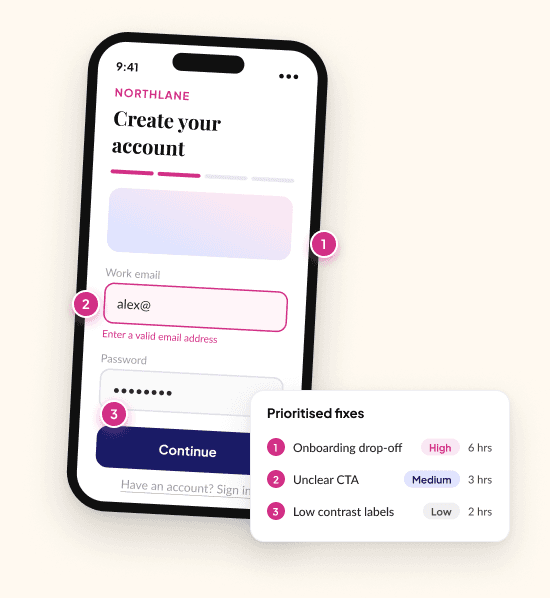
Almost every audit we run starts from one of these.
Sign-up feels longer than it should, and some people give up before they reach the good part.
They're asked for something personal and nothing on the screen tells them it's safe.
Buttons, colours and headers have drifted as features were added.
There's a long list of opinions and no order to them.
Not a script, and not a dashboard. We create a test account and go through sign-up, setup and the everyday tasks your users actually do, on desktop and mobile. We check every screen against our own checklist of the patterns that most often hurt trust, sign-up and everyday use. We start with what already works, so the fixes build on your strengths.
The document is yours. Take it to your board, your investors or your development team.
01
One page with the findings that matter most, written for non-technical readers.
02
The strengths we'll build on, so nothing good gets lost in the fixes.
03
Each step from first visit to everyday use, with what people want to know and what gets in the way.
04
Every finding tagged High, Medium or Low, with "what we saw" and "why it matters". High means it affects trust or sign-up. Medium makes the app clearer and easier to use. Low is polish and consistency.
05
Before-and-after designs in Figma for the screens that matter most.
06
Every change with an hour estimate, so you can decide what to do now and what can wait.
01
We agree the journeys and screens in scope, and you give us access to a test account or staging version (a private test copy of your app).
02
We use your app like a real user, on desktop and mobile, against our checklist.
03
We rank every finding, estimate the hours, and redesign the key screens in Figma.
04
We walk you through the findings and agree what to fix first. Then you decide what happens next.
For a consumer app preparing to launch, we reviewed every screen on desktop and mobile with a real test account. The audit opened with what already worked. It mapped the journey from first visit to everyday use, set out 10 prioritised findings, and included redesigns of the three screens that mattered most for trust and sign-up. Every fix came with an hour estimate. It ran alongside a code and security review, so the client got one plan for both.
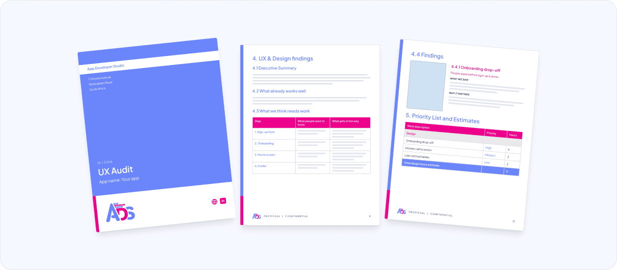
Client details are kept confidential. Pages shown are from our audit template, with dummy text.
Pair the UX audit with our Code Audit & Migration. A senior developer reviews the code while a senior designer reviews the product, and you get one report with one prioritised plan.
Explore Code Audit & MigrationUsually one to two weeks from kick-off to the handover call. We will confirm the timing when we agree on the scope.
Access to a test account or a staging version of your app, which is a private test copy. On the kick-off call we'll agree which journeys and screens are in scope.
No. We use your app the way your users do, on desktop and mobile. If you want the code reviewed too, pair this with our Code Audit & Migration. A senior developer reads your codebase, tells you what's actually there, and gives you a costed plan to fix it or move it to a new setup.
Every finding is tagged High, Medium or Low. High means it affects trust or sign-up. Medium makes the app clearer and easier to use. Low is polish and consistency.
We go through the findings with you on a handover call and agree what to fix first. You keep the written audit, suggested design mockups for the key screens and the costed fix list. Then you decide what happens next.
Yes, if you want us to. Every fix comes with an hour estimate, so you can choose what to do now and what can wait. Your own team can also use the audit and mockups as a guide.
No. A UX audit reviews the app you already have and tells you what to fix first. Design & Prototype is for designing new screens or products.
We scope it with you on a call first, then quote a fixed price. Book a short call and we'll agree the scope, the timeline and a fixed price.
